Showing posts with label creme. Show all posts

Wednesday, November 21, 2012

My First try with Acrylic Inks

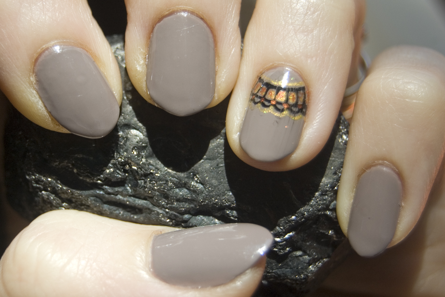
I mentioned with my first Halloween mani post that I had bought some acrylic inks to use for nail art. Well I thought I'd show you my first attempt with them. I started with OPI Berlin There Done That (two coats plus top coat):

I used black, gold, and copper inks for my design. One thing about the shimmery inks like the gold and copper is that they are quite sheer and show up better if used over a darker color. Layering them or using a bit more of the ink works well also though, as you can see I found out the hard way, it takes longer to dry that way.

Oh well, life is a learning experience. Now I know to let the ink dry thoroughly and have more top coat on the brush.

Another note about acrylic inks: you have to wait until your mani is COMPLETELY dry or the calligraphy nib will etch right through or catch on the polish and won't distribute the ink properly. This makes it the perfect way to change up a day or two-day-old mani.

Sunday, April 8, 2012

Berry Sweet

Wow, life sure got busy for a bit there! BUT, I am back and ready for some more posting! I have also realized something that makes me very excited: the OPI Nail Envy I have been using has really been working! What used to be nubbins on my index and middle fingers have now finally grown past my fingertips and beyond! I now promise to do my best to keep all my nails to the same length unless a) I break a nail - I refuse to sacrifice hard won length for an accident, and b) with the exception of my pinky nail which I have always preferred to keep longer than my other nails anyway.

So, now that we have that established on to something a bit more fun for the rest of you: nail art! A couple weeks ago BerryPolished had a nail art contest over on her facebook page with a theme of, what else, berries. I had a couple ideas that ended up not working out due to malfunctioning stamping plates but I really like the idea I ended up going with (that I totally cam up with on the fly the day before the end of the contest).

I started with two coats of L'Oreal How Romantic:

I then stamped over that with Zoya Kate using Cheeky plate CH3. And yes, the unfinished look is deliberate . . . mostly.

Then I used L'Oreal Haute Couture Red and Cheeky plate CH13 to add strawberries, and Zoya Yara with CH26 to add a bit of contrast while keeping with the country garden look.

And that is what I was GOING to submit to the contest until the second day of wearing the design. You should know me well enough by now, if you've been following along for a bit, that I can't leave anything alone. Almost any design can be improved upon and this was no exception. Well I went and added a coat of Wet n Wild Hallucinate over top of it all and loved it so much that I just had to submit that version instead.

Isn't it just so cute! I absolutely love how this turned out and I also love that my nails are now long enough to really show off cute designs like this <3

Sunday, March 11, 2012

Expect Greytness or From Drab to Fab

Yeah, I'm on a roll with the cheesy titles XD

Ahem. Anyway, today I've got a bit of layering fun to show you. I started off with two coats of L'Oreal Greyt Expectations, a mauve-ish grey creme:

Then I used a makeup sponge to create a gradient with Milani Hi-Tech:

And topped with two coats of Nail-Venturous Rustic Remains:

I really wasn't feeling the balance of this though as I felt I had brought the gradient a bit too far up my nails. I needed something else to complement the middle-warm tones of Greyt Expectations but I wanted to keep with the texture of the holo/flakie polishes on top. So I freehanded a line along the edge of my nails with OPI DS Opulence:

The last photo comes closest to capturing the incredible sparkle of this combination but even it fall far short of reality. I think I'm going to try Rustic Remains over DS Opulence next since we have a few sunny days in the forecast this week!

Saturday, March 10, 2012

Blue, Bronze, and Read all Over

For some reason I've been really attracted to dusty blues and greens this season, so when I saw Zoya Bevin I just knew I had to get her. Such a lovely shade of dusty turquoise <3 And of course application was a breeze as I've come to expect from Zoya. The photo below is two coats with top coat and taken in indirect lighting.

Just a couple weeks ago I realized that I had never posted a newsprint mani on my blog, nor had I worn one in quite some time so I decided that was just what I was going to do with Bevin. Now you might be thinking that this color is too dark for a newsprint mani, and to be honest I was a little nervous about that myself, but it turns out that Bevin is perfect! I also decided to put a different twist on the usual newsprint mani and applied the newspaper to my nails so the the words went down the length of them rather than across.

Then I used Mash plate 09 with Borghese Riviera Sunset. I wanted to put the stamp right up next to my cuticle but it didn't work out very well so I decided to just go crazy and put the stamp everywhere and anywhere all over my nails. I rather like how it turned out actually.
 before cleanup


If you've never done a newsprint mani before I recommend trying one, they're super easy! All you need is newspaper (I used an article about chocolate deserts, you can see the word "chocolate" on one of my nails above), a shallow dish with alcohol (rubbing alcohol works just fine but some people like using vodka), and fingernails with a medium to light creme-finish polish.

Cut the newspaper into pieces just larger than your nails. Then dip the paper into the alcohol, position it on a nail, and press evenly across the paper for 10-30 seconds. Peel the paper off and voila! Remember to put a top coat on or the ink will rub right off.

Friday, November 11, 2011

Stitching up Some Plaid

Some days I'm glad I only have time for a couple posts a week. It means I can post stuff that I actually have sun-lit photos of. Have I mentioned I hate winter? Have I also mentioned I hate the whole Daylight "Savings" rigmarole? Arg!

Anyway, to get me in a better mood let's talk polish! I've got a great one here today. I had been looking through all my untried polishes and trying to decide between the four Essie polishes I'd gotten for my birthday when I had a great idea: just use all of them! Well almost all, I didn't use Sexy Divide but I'll get to that eventually.

I decided to use In Stitches from the Fall 2010 collection as the base color:
Full sun

Shade

I never thought I'd love cremes as much as I do. Now I'm just about swimming in them! So of course then I had to come up with a nail art design. I remembered how much fun I had doing my orange plaid and decided that plaid would work quite nicely, especially considering the names of a couple of the polishes I was using.

Essie In Stitches, Sole Mate, Merino Cool, and OPI My Private Jet (version #5)

I used my striper brush to apply a line of Merino Cool down the length of each nail, then Sole Mate across the width. Next came MPJ down the middle and another stripe of Merino Cool across it. 

I love the simplicity and repetition of this and the pop of glitz from the MPJ.

Saturday, October 15, 2011

For the Love of Creme and Holo

I have developed a love for Sinful Colors creme-finish polishes.  There, I've finally put it into writing. Sure it's a drugstore brand but the quality is no less for all that and it is definitely affordable! That said I've decided to dedicate this post to a couple SC cremes . . . and the extra bling I added to a couple by adding a holo over the top >.>

Ok, first up I have SC Starfish. I found this at one Walgreens at the beginiing of summer, decided to wait, came back later and it was gone! I was kind of upset and proceeded to search every Walgreens and Rite Aid in the area to find it. Eventually I did and I immediately snatched it up. I'd learned my lesson! No more wishy-washies when it comes to Limited Edition polishes!

I just love that dusty rose-pink <3 After a bit of wear I spiced it up with the gLORIous top coat:

Go ahead and click it. I know you want to ogle that lovely rainbow closer up ;)


Next up I have a very fall appropriate color, SC Vacation Time. It reminds me of a terracotta pot but a bit more pink than orange. This was a color I picked up just because it caught my eye at the time and I'm very glad I did.

And then I topped it with two coats of Wet 'n' Wild Hannah Pinktana:

Blurred to show the sparkle.


And last but not least here is SC Innocent, a lovely spring green. I loved this color so much I couldn't bring myself to put anything over it. I did wear it when we went apple picking a few weeks ago however ;)